Image-to-palette workflow
How to make a color palette from an image
A useful image palette is not just a list of the most common pixels. It is a small, editable set that preserves the image's visual story and can survive real design decisions.
color palette from an image
How do you create a color palette from an image?
Upload a clear source image, extract a small set of representative colors, then edit the result instead of accepting it blindly. Keep one dominant color, useful supporting colors, a readable light and dark anchor, and only the accents that matter. Toon Tone can generate 5 or 8 swatches locally in the browser, let you lock good colors, regenerate the rest, and export HEX, RGB, HSB, CSS, or a PNG palette. Finish by checking every color in its real context and running a separate contrast test for text.
The short answer
- Start with a well-lit, intentional image and crop away borders, watermarks, UI chrome, or irrelevant background areas.
- Use 5 colors for a focused identity and 8 colors when the image needs extra accents, materials, shadows, or states.
- Lock the swatches that carry the subject, then regenerate noisy near-duplicates rather than rebuilding the whole palette.
- Export exact HEX or RGB values for handoff, and treat HSB as an editing aid rather than proof of perceptual equality.
- A beautiful extracted palette is not an accessibility result; test foreground-background contrast separately.
Choose one color, five colors, or eight colors
The right output size depends on the decision you need to make, not on how many different pixels the image contains.
| Output | Best for | Keep | Watch for |
|---|---|---|---|
| 1 sampled color | Matching a known object or pixel | The exact point and HEX value | A single pixel may be a highlight, shadow, or compression artifact |
| 5-color palette | Brand direction, compact UI themes, and focused illustration | Dominant, support, light, dark, and accent roles | Near-duplicates can waste one of the limited roles |
| 8-color palette | Richer scenes, character art, data series, and multi-state systems | Extra material, secondary accent, and shadow families | More swatches can make hierarchy weaker unless roles are named |
Start with the image, not the algorithm
Palette quality begins before extraction. A photograph with mixed lighting, a screenshot with browser chrome, or a compressed thumbnail can contribute colors that belong to the capture process rather than the subject. Crop to the area whose mood or identity you actually want. Prefer the original-resolution file, keep intentional highlights and shadows, and remove decorative borders or unrelated objects. If the same product was photographed under warm and cool light, decide which appearance is authoritative before asking a tool to summarize it. An extractor can count pixels and group neighbors; it cannot decide which version of the scene represents your design goal.
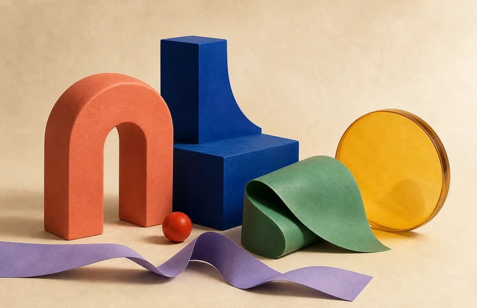
Look at the source at thumbnail size and name the roles you expect before generating anything. In the sample above, coral carries the warm foreground, deep blue gives structural weight, green and yellow act as distinct supports, purple is a narrow accent, and the warm neutral background controls the atmosphere. That role sketch is a useful test. If an output contains three nearly identical beiges but loses the coral, the result may be statistically common yet editorially wrong. A palette is a model of the image for a particular job, not a scientific inventory of every visible pixel.
Turn extracted swatches into a working system
Generate once, then assign a job to each swatch. A compact five-color set usually needs a dominant color, one or two supporting families, a light anchor, a dark anchor, and an accent. The labels can change for illustration, branding, interfaces, or data visualization, but the hierarchy should remain legible. Lock the colors that clearly preserve the subject. Regenerate the unlocked positions if they repeat an existing hue, capture a tiny highlight, or over-represent a neutral background. Small changes are easier to judge than repeatedly replacing all five or eight colors, because the stable swatches give every new candidate a consistent context.
After the families are right, inspect the exact values. HEX and RGB preserve the browser color directly; HSB makes hue, saturation, and brightness easier to edit. Round only for a stated reason. A one-digit change may not matter in a casual mood board, while a shared design token should retain the approved six-digit HEX. Also record where the palette came from, which image version was used, and which swatches were manually adjusted. That short provenance note prevents a future teammate from treating an extracted accent as an official brand color or trying to recreate the palette from a different crop.
Validate the palette in the place it will be used
Move the palette out of the generator and into a realistic preview. Place text over the intended background, view buttons in default, hover, focus, and disabled states, and test illustration swatches at the size they will actually occupy. A color that looks distinctive as a large square can disappear as a two-pixel line. Neighbors also change perception: the same gray can look warm beside blue and cool beside orange. Check both light and dark themes when relevant. If a color only works because the extraction screen surrounds it with white, it is not ready for a product that uses a dark canvas.
Accessibility and color fidelity need separate methods. WCAG 2.2 requires at least 4.5:1 contrast for normal text and 3:1 for large text at Level AA; the fact that two swatches came from one attractive image does not satisfy those ratios. Likewise, a browser palette is a useful sRGB design record, not a calibrated print proof. Use the correct contrast checker for text, Delta E for a named color-difference comparison, and a managed print workflow for physical output. Keep the palette as the creative starting point, then let the governing test approve the final use.
A five-step image palette workflow
Use this sequence when a reference image needs to become a reproducible palette for design, code, or color-memory practice.
1. Define the decision
Name the output first: one sampled color, a focused five-color set, or a richer eight-color system. The number should serve a real use case.
2. Prepare the source
Use the best available file, crop irrelevant regions, and choose the lighting or edit that represents the intended appearance.
3. Extract and label
Generate the palette, then label dominant, support, light, dark, accent, and any additional material or state roles.
4. Lock and refine
Keep the swatches that carry the image, regenerate near-duplicates or artifacts, and adjust HSB only with a visible reason.
5. Export and test
Save exact CSS or HEX values, preserve a PNG reference, and verify contrast, context, gamut, and the final production medium separately.
What browser extraction can and cannot prove
The method rests on browser pixel access and standard color definitions, but extraction is still an editorial reduction. These official references define the technical floor and the limits around it.
- Canvas getImageData can return a selected rectangle as ImageData; its common rgba-unorm8 format uses 8 bits per red, green, blue, and alpha component. MDN Canvas getImageData documentation
- CSS Color 4 defines sRGB with three numeric components in the 0–1 range and a D65 white point, while also documenting wider spaces such as Display P3. W3C CSS Color Module Level 4
- Palette extraction does not replace WCAG testing: Level AA minimum contrast is 4.5:1 for normal text and 3:1 for large text. W3C WCAG 2.2 contrast criterion
- Adobe's current image-palette guidance says most palettes contain 3–5 dominant colors and recommends refining the swatches after upload. Adobe Color image palette guidance
returns an ImageData object representing the underlying pixel data for a specified portion of the canvas.
MDN · W3C · Adobe
Official sources and further reading
Extract the palette, then test the colors
Image color palette FAQ
How many colors should I extract from an image?
Use five when you need a compact hierarchy and eight when the image has meaningful secondary accents, materials, or states. More colors are not automatically more accurate; every swatch should have a role.
Why does an extracted palette sometimes look dull?
Large neutral backgrounds, mixed light, shadows, compression, and repeated low-saturation pixels can dominate the sample. Crop the source, lock the important colors, and regenerate the noisy positions.
Is a dominant color the same as the most important color?
No. Dominant often means visually common, while an important accent may occupy very little area. Keep editorial importance separate from pixel frequency when refining the palette.
Can I use an image palette directly in CSS?
Yes, after review. Export exact HEX or CSS variables, name each role, test components in context, and run the required contrast checks before treating the values as production tokens.
Does the Toon Tone palette generator upload my image?
No. The current tool reads the selected image locally in the browser. As verified on July 22, 2026, it offers five- and eight-color modes plus locked regeneration and CSS or PNG export.