How to compare and remember red cartoon colors
Red is difficult because the hue circle wraps at zero: one small move can push a target toward orange, while the other direction heads toward magenta and pink. Use the same sequence as a Toon Tone round—hue, saturation, then brightness—and compare one decision at a time.
Place the hue between orange-red and crimson
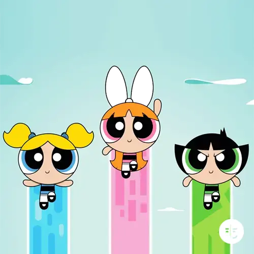
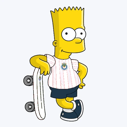
Start with hue because the six targets occupy both sides of central red. Blossom and Bart lean warmer, while Hello Kitty and Steven sit just across the zero point toward crimson. Pinocchio stays near the middle. If you tune brightness first, a warm red can look convincing even while its underlying hue is too orange.
Use pairwise comparisons instead of a generic red label. Compare Blossom with Hello Kitty, then Bart with Steven. Ask which target feels warmer before touching saturation. This turns a circular hue boundary into a practical memory choice and prevents every famous red detail from collapsing into the same slider position.
Use saturation to separate bold red from coral
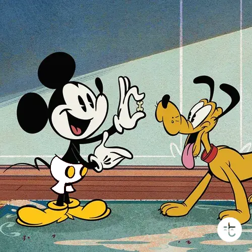
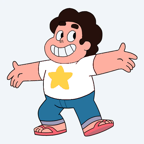
Saturation controls how pure or softened the red feels. Bart, Hello Kitty, and Pinocchio need strong saturation, while Steven's shirt contains more visual softness. Mickey sits between those extremes. A common mistake is to make every iconic red as intense as a logo, even when the actual practice target is muted or lightened.
After choosing hue, lower saturation farther than your first instinct and raise it slowly. Stop when the color looks recognizable without becoming fluorescent. This method makes Steven's coral-red easier to distinguish from Hello Kitty's crimson and helps preserve Mickey's darker character without adding unnecessary gray.
Tune brightness last and compare the endpoints
Brightness creates the clearest contrast in this set. Mickey's shorts are much darker than Blossom's bow or Steven's shirt. If the hue is correct but brightness is too high, Mickey can resemble a bright costume red; if Steven is too dark, the shirt loses its coral quality and feels heavier than the prompt.
Use the darkest and lightest targets as anchors. Practice Mickey, then Steven, before trying the middle reds. The reveal values show whether your memory repeatedly lifts dark colors or suppresses light ones. Once those endpoints feel stable, Pinocchio and Hello Kitty become easier to place between them.
Read each card as practice data, not an official palette
The HEX and HSB values on this page are Toon Tone practice targets for the parts named on each card. They are not official studio color keys, licensing specifications, or a claim that every episode, film, print, or product uses one fixed red. Lighting, source art, shading, compression, and display settings all affect appearance.
That limitation still supports useful training. Every round compares one saved target with one player guess through the same color model. The consistent setup lets you notice whether hue, saturation, or brightness caused a miss. Use the values to improve color memory and compare red families, not to certify a brand color.
Build a short red practice sequence
Begin with Pinocchio as a central red, move to Blossom for a warmer hue, and then try Hello Kitty on the crimson side. Finish with Mickey and Steven to test brightness. This order changes one major variable at a time instead of asking memory to solve hue, saturation, and brightness simultaneously.
After each reveal, record the slider with the largest difference. Repeat only the pair that exposes the same bias: warm versus crimson for hue, Hello Kitty versus Steven for saturation, or Mickey versus Steven for brightness. Focused comparison produces clearer feedback than replaying six unrelated targets at random.